Product design
In-person payments
A point of sale on the phone in your pocket, with in-store and online sales in one place.
- 01 The callIn January, the CCO asked if we could take real payments at our booth in March.
- 02 The bare minimumEnter an amount, take the payment, offer a receipt. Everything else could wait.
- 03 The receiptTyping a stranger's email address at a busy booth is clumsy, so the receipt became a QR code.
- 04 The boothIt was the busiest booth at the fair, by a long shot.
- 05 Starting overThe rush left debt everywhere, so going on sale properly meant starting again.
- 06 What merchants noticedEvery result our customers talk about comes back to a design call.
- 07 What's nextAndroid and the terminal are live. iPad is next, then checkouts with nobody behind the till.
- 08 ConclusionShow the value fast, and don't get hung up on what doesn't matter yet.
Case study
Taking payments in person, straight into the same place as online.
01 · The call
In January, the CCO asked if we could take real payments at our booth in March.
Kustom had been invited to host a booth at DCongress. Competitors assumed we were busy migrating our checkout, and would turn up with something checkout-shaped. We wanted to show the bigger picture: payments everywhere a merchant sells, online and off.
Plenty of merchants run their shop tills and their online store in separate systems, and reconcile the two by hand. With Stripe behind us, a bare-minimum app could take payments in person and put them in the same place as the online ones.
02 · The bare minimum
Enter an amount, take the payment, offer a receipt. Everything else could wait.
The squad was me, one front-end engineer, and a smattering of back-end and infra help. I designed every screen and flow. The goal: live on the Apple App Store in time for the show.
So the finish that makes a product feel complete stayed out. No profile pictures, no account recovery, no deep settings, no personalisation, and very little time spent on looks.
Then Apple had its say. Payments apps face a high bar, and "not needed yet" gets you rejected. Our only users would be Kustom staff, but the app still needed a way for the public to sign themselves up, and a Tap to Pay tutorial for everyone. Without the App Store there are no real payments, so both went back in. We were accepted with a few days to spare, after a lot of late nights.
What the first version did
- Enter an amount
- The seller keys in what the customer owes
- Take the payment
- Tap to Pay on the phone itself, no extra hardware
- Offer a receipt
- A QR code the customer scans
- Stay compliant
- With the Swedish tax agency, and with Apple
03 · The receipt
Typing a stranger's email address at a busy booth is clumsy, so the receipt became a QR code.
Receipts were scoped as email. That meant the seller typing in a customer's address, or handing their phone over to let them do it. In the last sprint before the show I swapped it for a QR code: the customer scans it, and emails the receipt to themselves if and when they want it.
Some of the first real payments
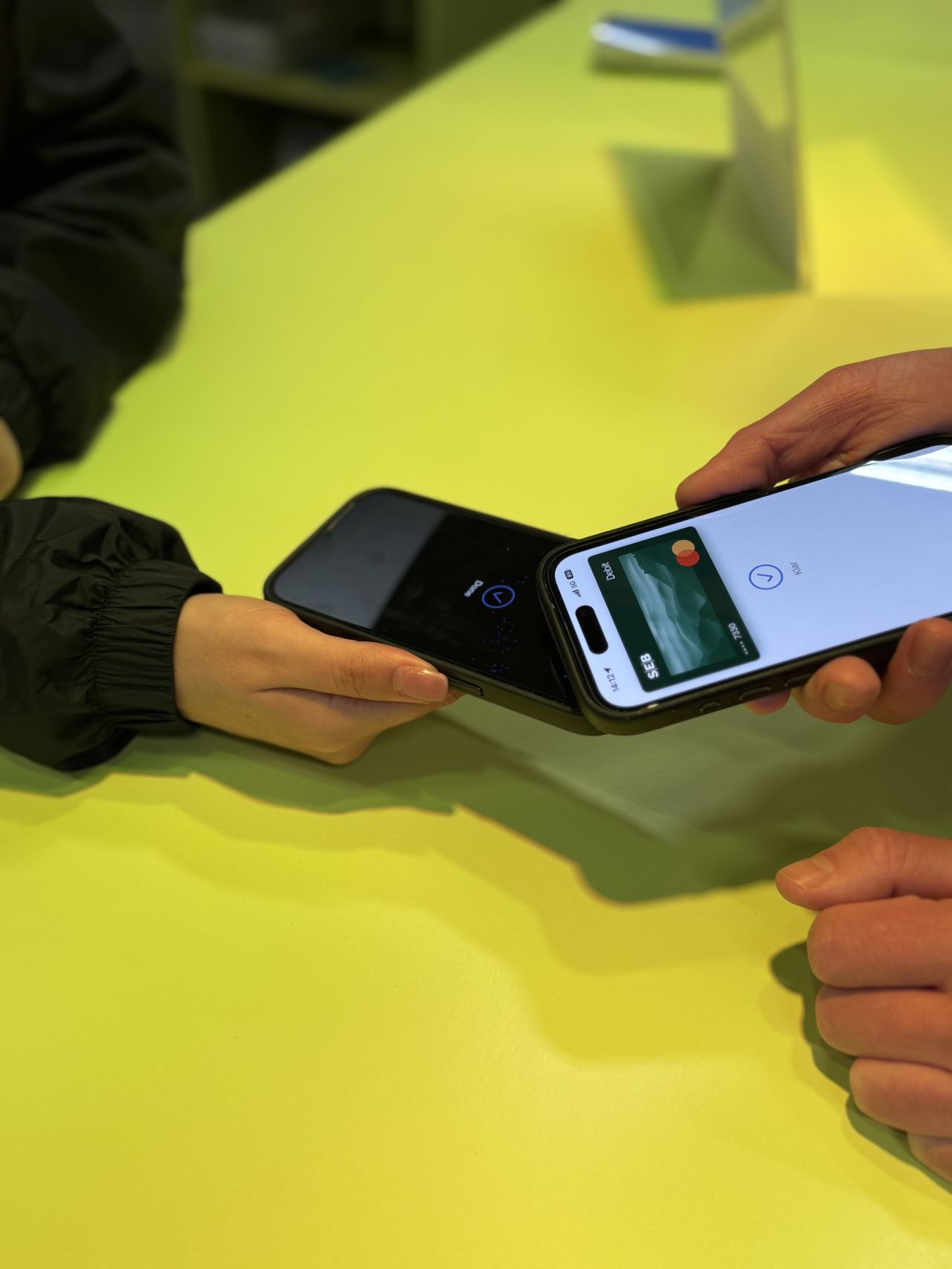
Key in 30 kr. Tap. Scan. Receipt.
Filmed at the booth, just in time for DCongress: the amount, Tap to Pay, the customer's card, the QR code, and the receipt landing on their phone.
04 · The booth
It was the busiest booth at the fair, by a long shot.
Our own staff were the users, so feedback was instant.
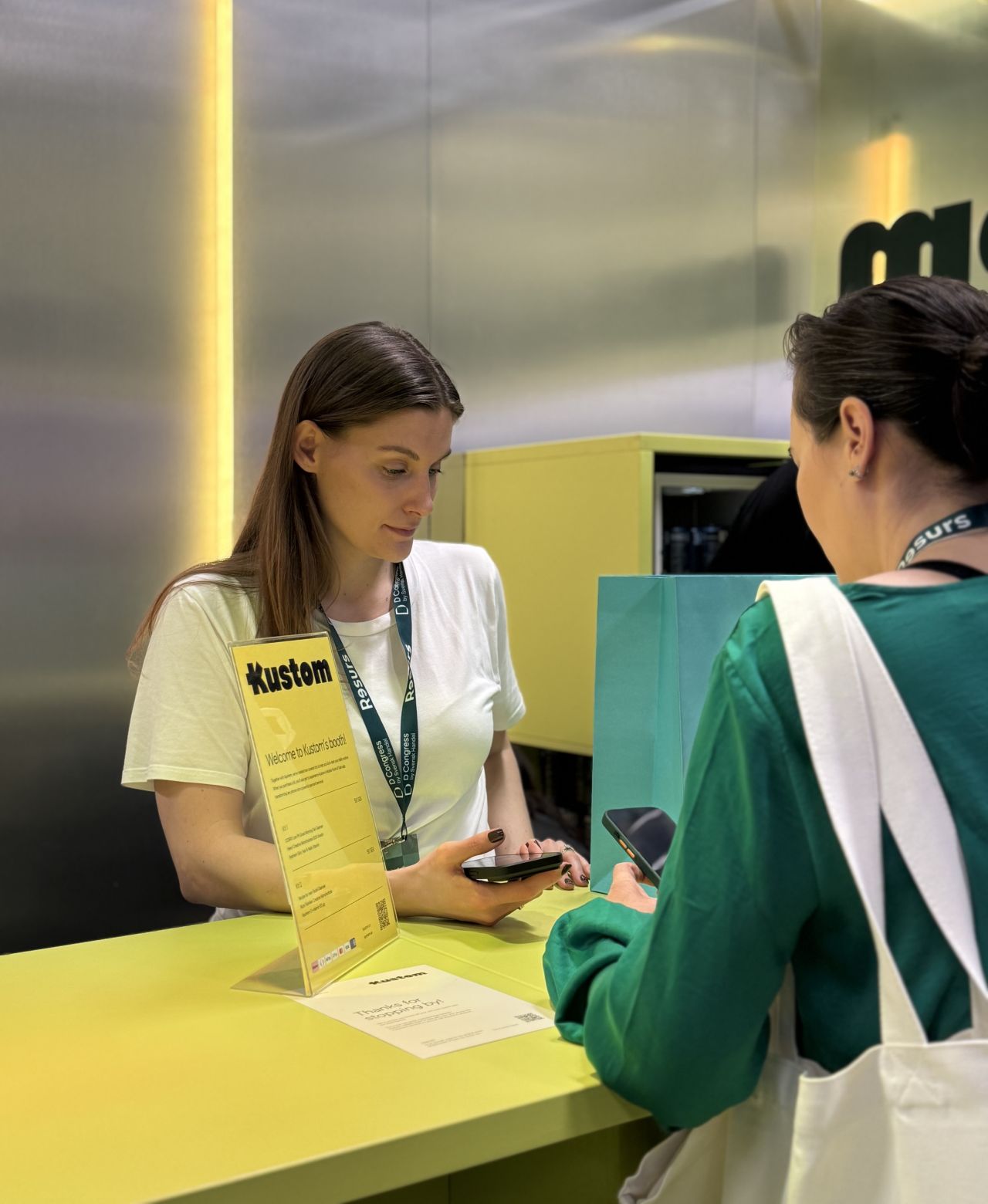
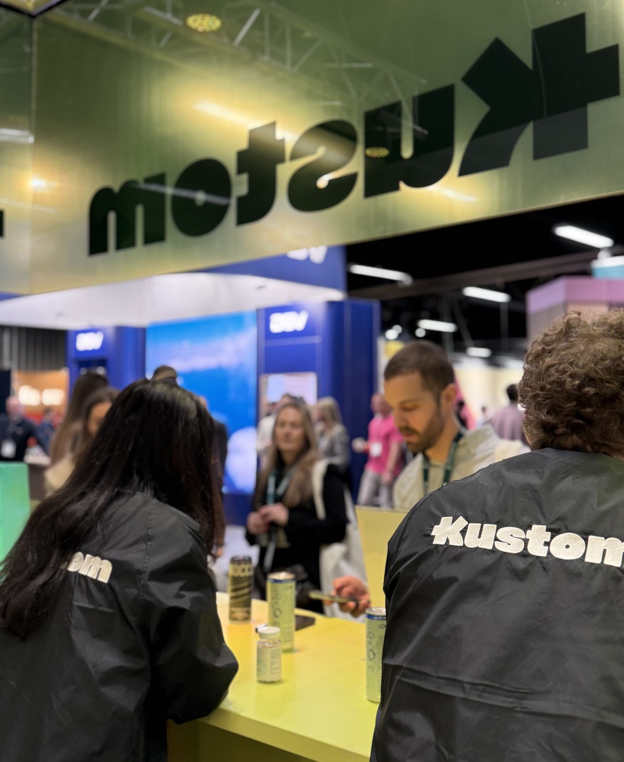
The Kustom booth at DCongress.
05 · Starting over
The rush left debt everywhere, so going on sale properly meant starting again.
The app went on hold until the checkout migration finished, in the summer of 2025. Then we rethought the tech and the design for general availability: the merchant's own products, Swedish cash register rules, many staff across many stores, iPad and Android.
I started with products. Instead of typing an amount and then what it was for, the seller taps the product, and the receipt already knows what was sold. Compliance with the cash register rules came next. Android was an easy win after Apple. Then the Stripe S700 terminal, which runs the same software.
The team grew from a rag-tag group of firefighters to a PM, an EM and five engineers, with me as the one designer across all of it.
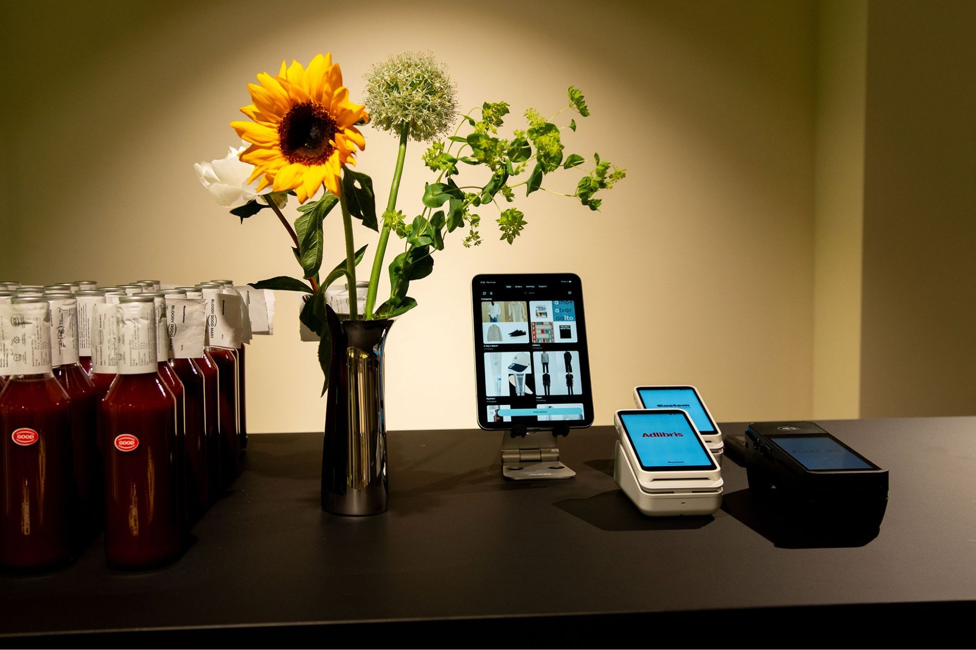
The point of sale on an iPad, beside two terminals.
06 · What merchants noticed
Every result our customers talk about comes back to a design call.
Koenigsegg sells merch at events, SC Styling at motor shows, and Skolyx opened its first physical shop in 2026 after fourteen years online. A major Swedish pharmacy chain uses it in store as a terminal for out-of-stock goods: an online order, paid for in the aisle. Their stories are public on the Kustom site. Here's what they said, and where it came from.
What they said, and the call behind it
- "Just download the app and go" (Koenigsegg)
- Self sign-up and the Tap to Pay tutorial, the two things Apple made us add
- Shorter queues (Koenigsegg, SC Styling)
- One tap per product, instead of typing an amount
- Klarna on the spot for racing wings and wheels (SC Styling)
- Scan to pay beside card, so the customer picks how to pay on their own phone
- A short learning curve (Skolyx)
- The merchant's own branding on the terminal, mirroring their online shop
- Receipts with no typing
- The QR code
07 · What's next
Android and the terminal are live. iPad is next, then checkouts with nobody behind the till.
The iPad version is designed and waiting for development: the whole catalogue on one screen, stock levels on every product, and the cart and payment side by side.
After that, unattended checkout: self-service kiosks and vending, and recognising a returning customer by their card.
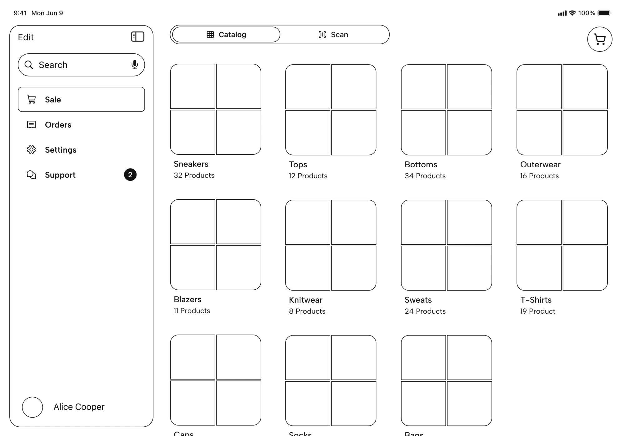
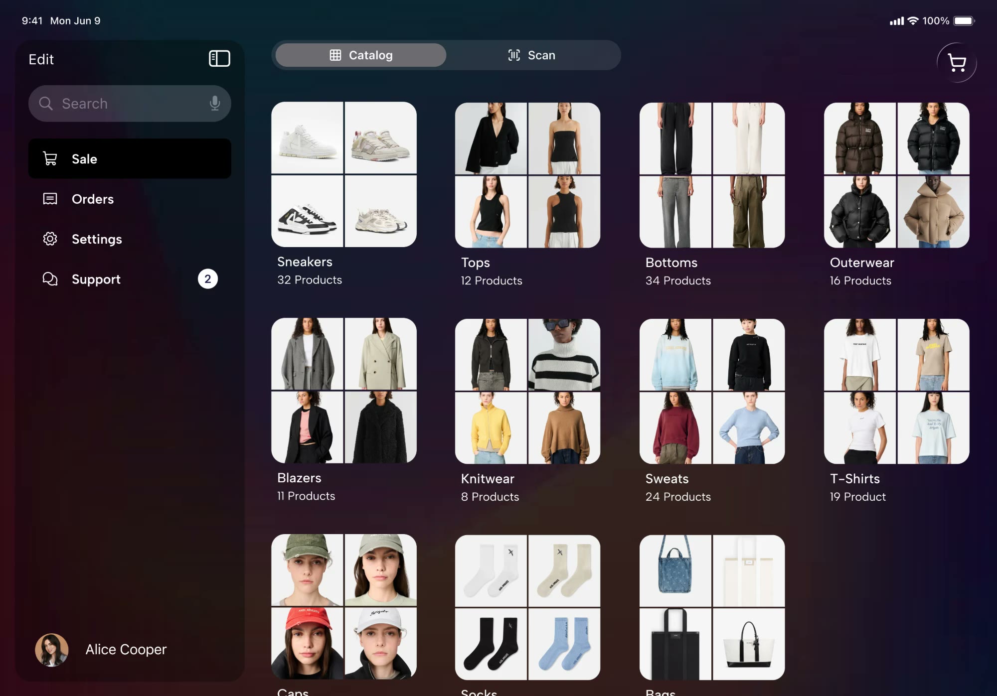
The iPad catalog.
08 · Conclusion
Show the value fast, and don't get hung up on what doesn't matter yet.
Two months, one engineer and a trade-show deadline forced every decision down to what a sale actually needs. What Apple made us put back in turned out to be what merchants noticed first.