Product design & leadership
Pollen
How I stopped Pollen positioning premium destination holidays as impulse buys.
- 01 Impulse buysPollen was trying to sell the trip of a lifetime as if it were an impulse decision.
- 02 ArtworkEvery poster was a one-off, and it showed.
- 03 Tools & rulesPollen stepped back, so every event could dress for itself.
- 04 Pitch sites92% of visitors arrived from Instagram, so the pitch site behaved like Instagram.
- 05 BookingThe booking site stopped being original and started being familiar.
- 06 The endPollen went into administration in August 2022, nine months after I joined.
Impulse buys
01
Pollen was trying to sell the trip of a lifetime as if it were an impulse decision.
Pollen started out selling festival tickets. After covid it sold whole trips: an artist, a destination, a hotel and a week away. But the brand, the artwork and the websites still behaved as if it sold tickets, something you grab in a moment and forget.
I led design for everything a customer did before the event, with a team of seven designers.
Artwork
02
Every poster was a one-off, and it showed.
Every event was getting its own unique artwork, made by hand for every size and every medium. It was painfully slow to produce.
The results missed on two counts. No two pieces looked alike, so nothing felt like one company. Yet every piece was dominated by Pollen’s own loud style, so the event itself got lost. A heavy-metal festival and a yoga retreat should feel like different worlds, with Pollen quietly vouching for both.
Most of it also only worked big. Shrunk to a phone screen, the detail fell apart.
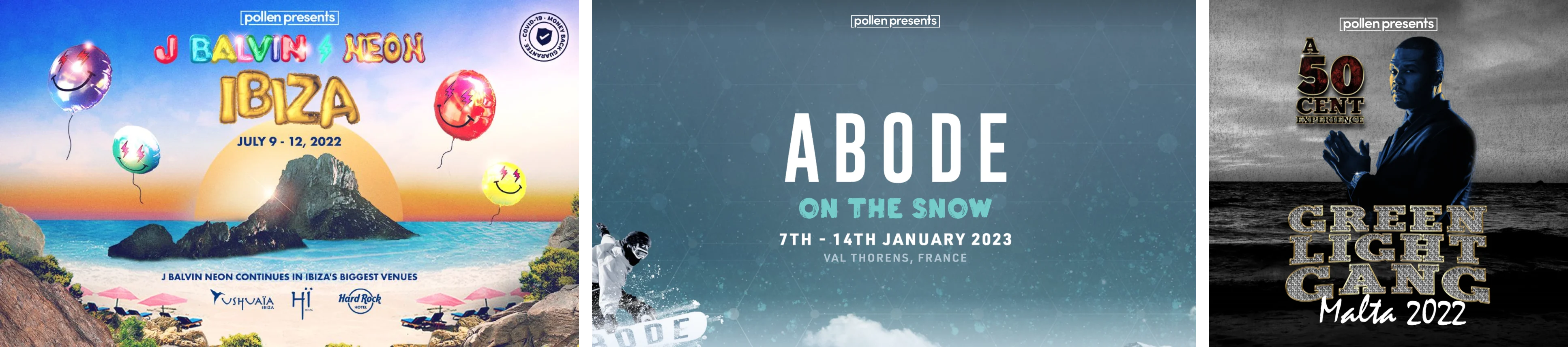
Before.
Tools & rules
03
Pollen stepped back, so every event could dress for itself.
We split the work in two. Pollen became the structure: the grid, the body text and a small logo, the same on every poster. The event became everything else, its colours, images and logo, so each one looked and felt like itself.
Then we turned that into a tool: one Figma template, with a variant for every size and medium. Marketing picks two colours, two images and the event’s logo, and the template does the rest, from an Underground poster to an Instagram story.
The rules
- Colour
- Two per event: a primary and an accent, chosen to suit it.
- Images
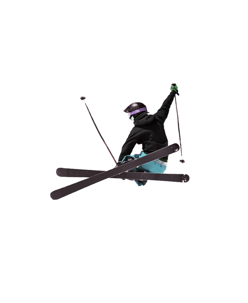
- Two: a background for the place or mood, and the artist in the foreground.
- Logo
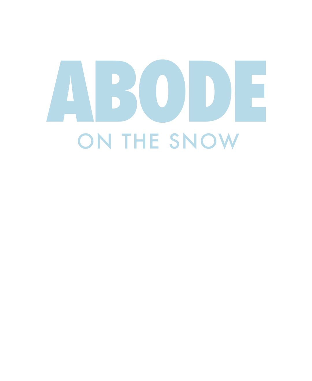
- The event’s own logo, set large enough to lead the poster.
- Body
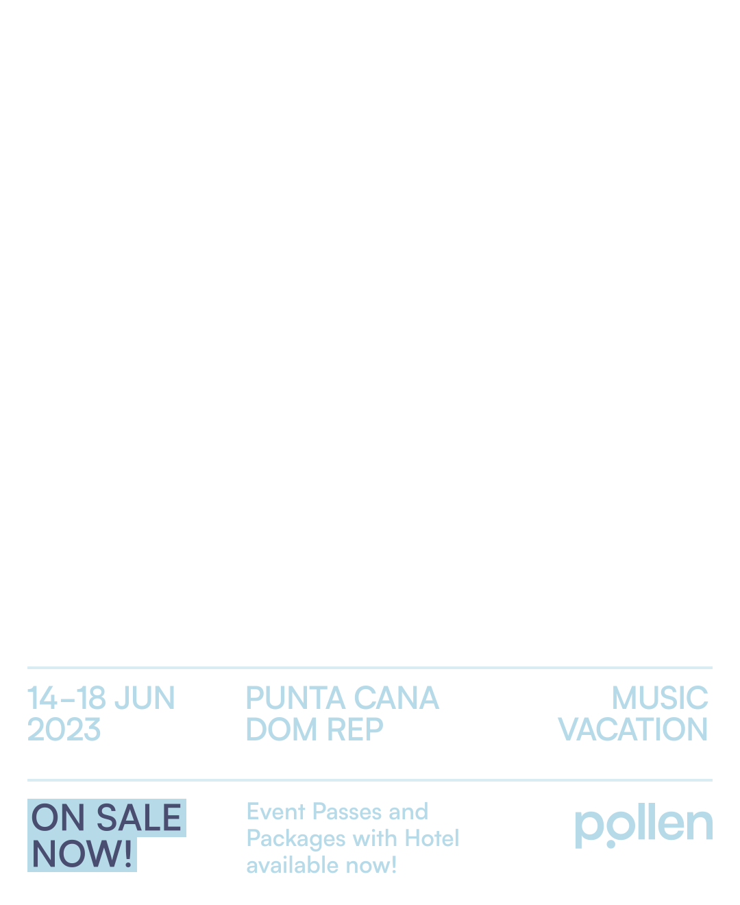
- Dates and place on the left, and a ticked list of what’s included on the right.
- Pollen
- A small logo, bottom right. Nothing more.
- Sizes
- One grid for every format: post, story, banner and newsletter.


The layers
01
Two colours
A primary, under everything. An accent, for every word on top.
02
Background image
The place, or the mood. Here, the Alps.
03
Foreground image
The headline act, or the moment. Here, a skier, cut out.
04
Event logo
The event’s own logo, set large, in the accent colour.
05
Body
Dates, place and what’s included, in the accent colour. Laid out the same on every poster.
One template, five events


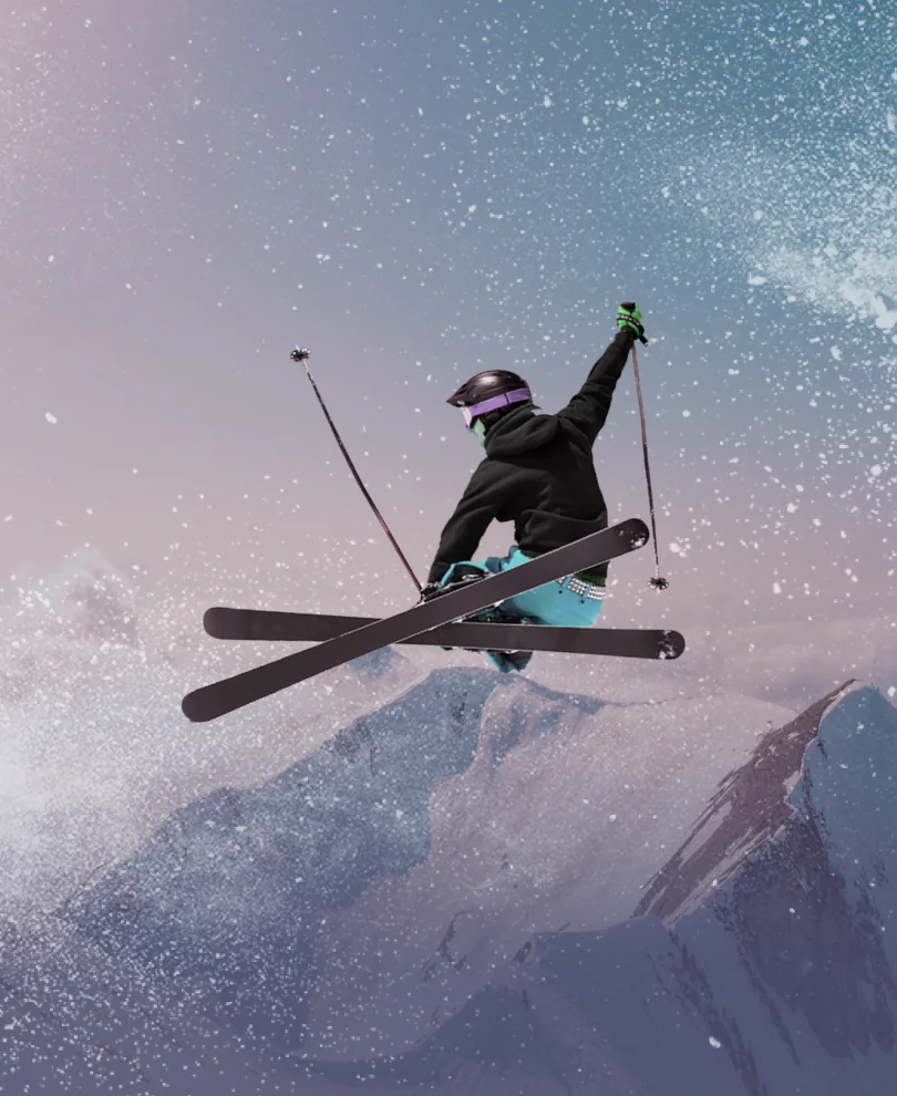
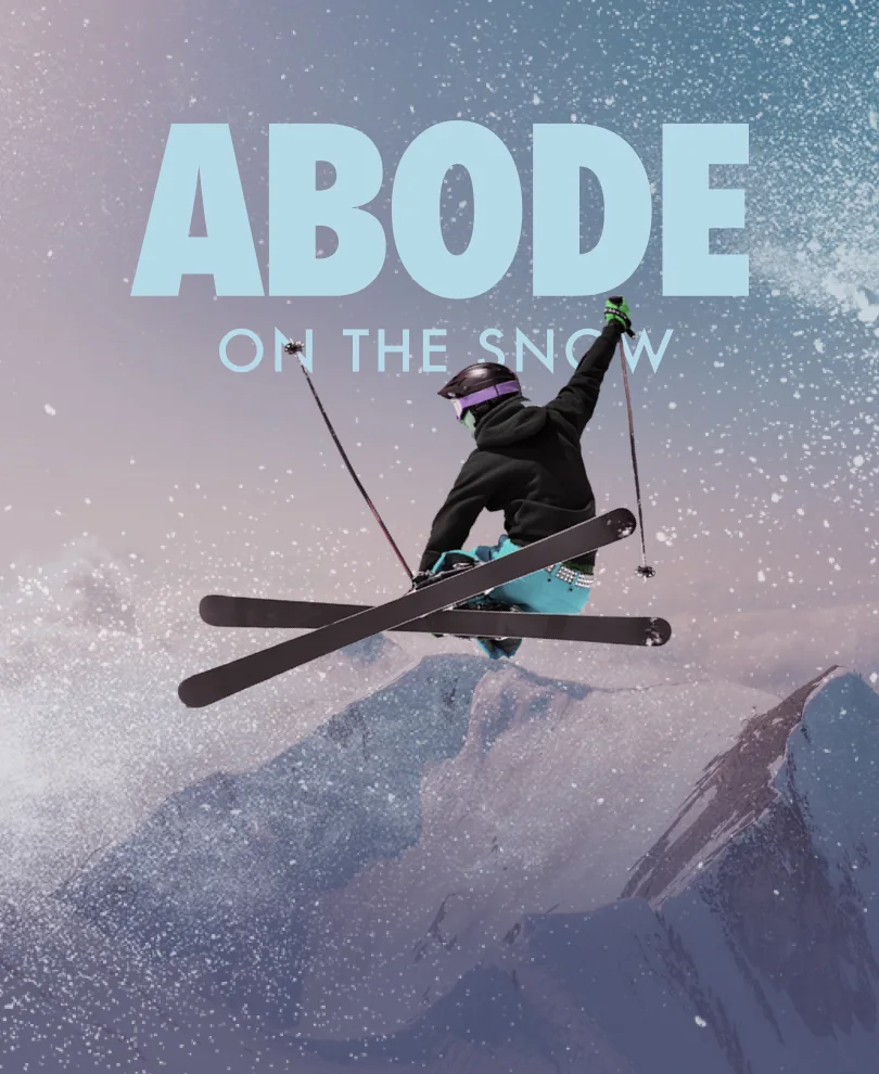

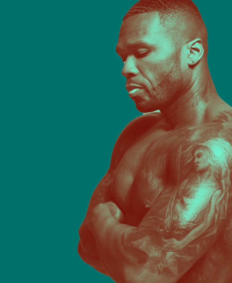
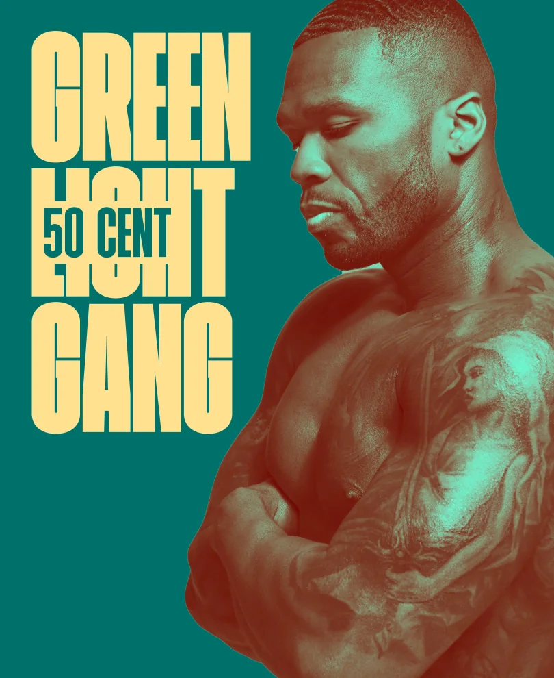
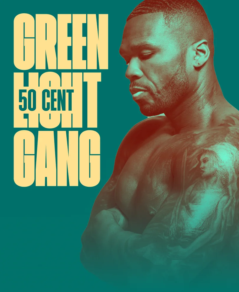

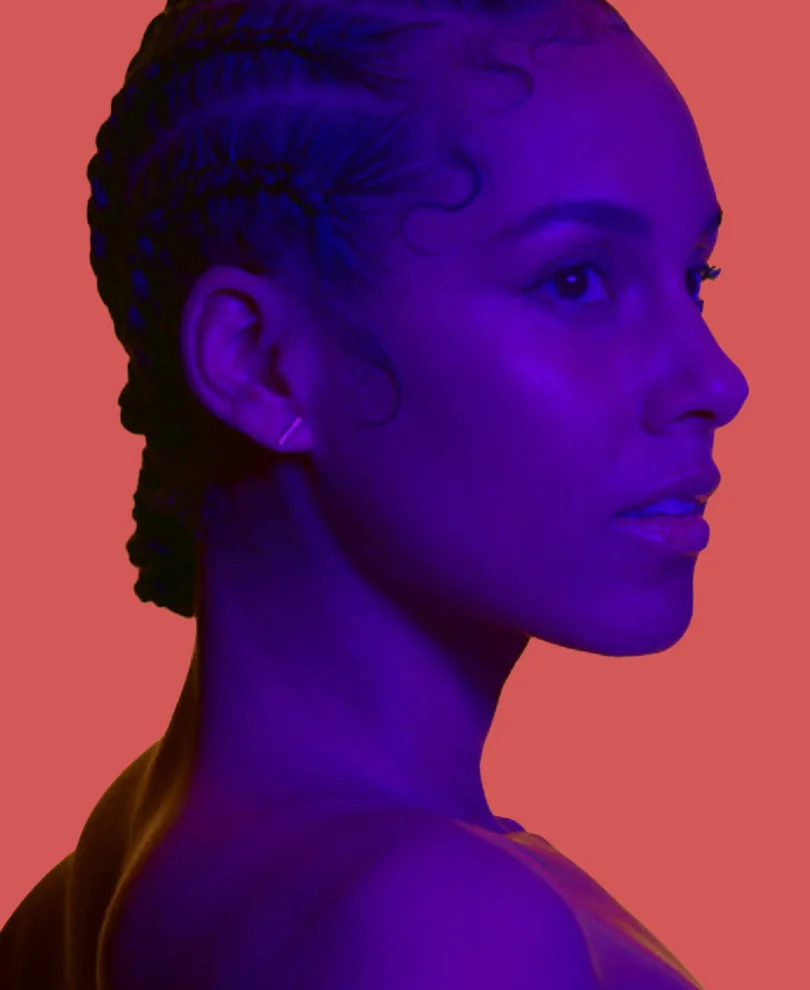
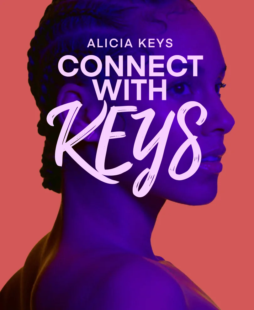


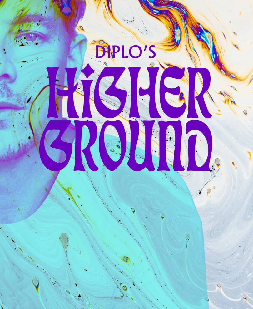

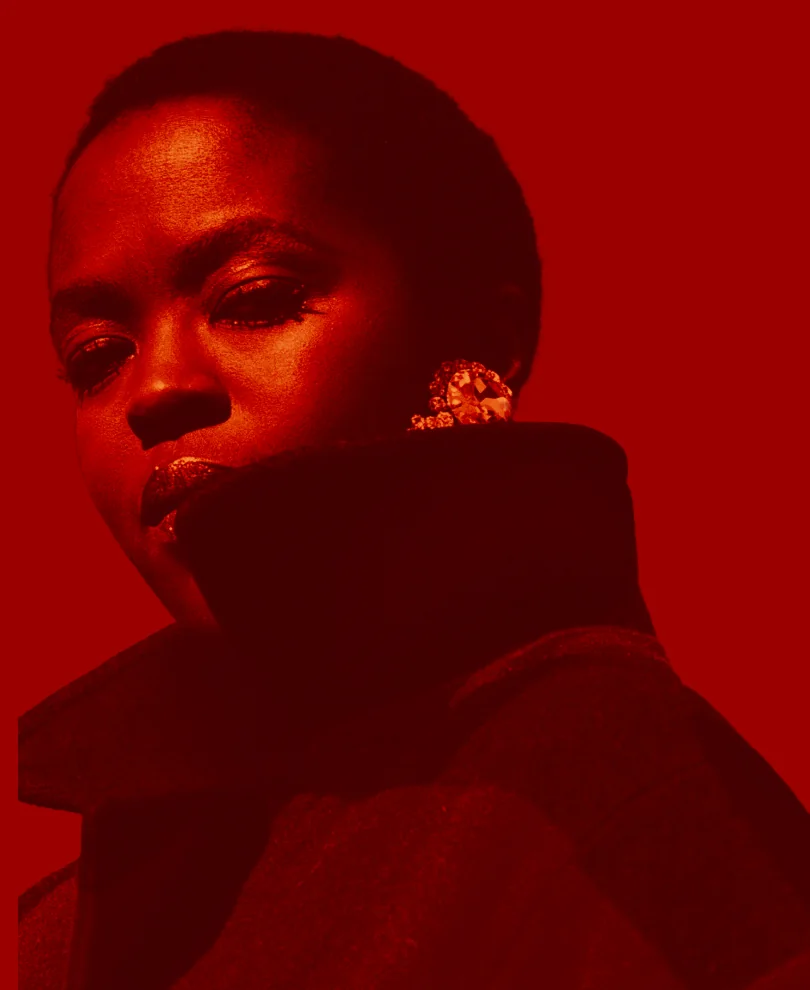
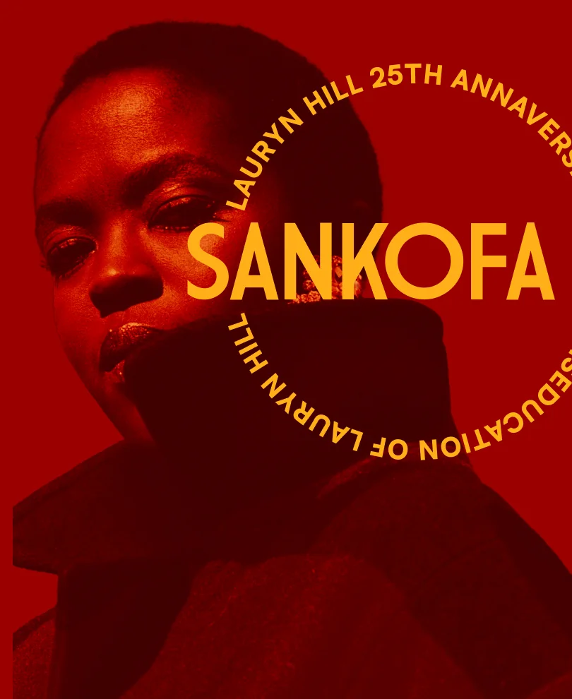
- Abode on the Snow
- Green Light Gang
- Connect with Keys
- Higher Ground
- Sankofa
Five events from one template: the ingredients change, the body never moves.
One template, every size
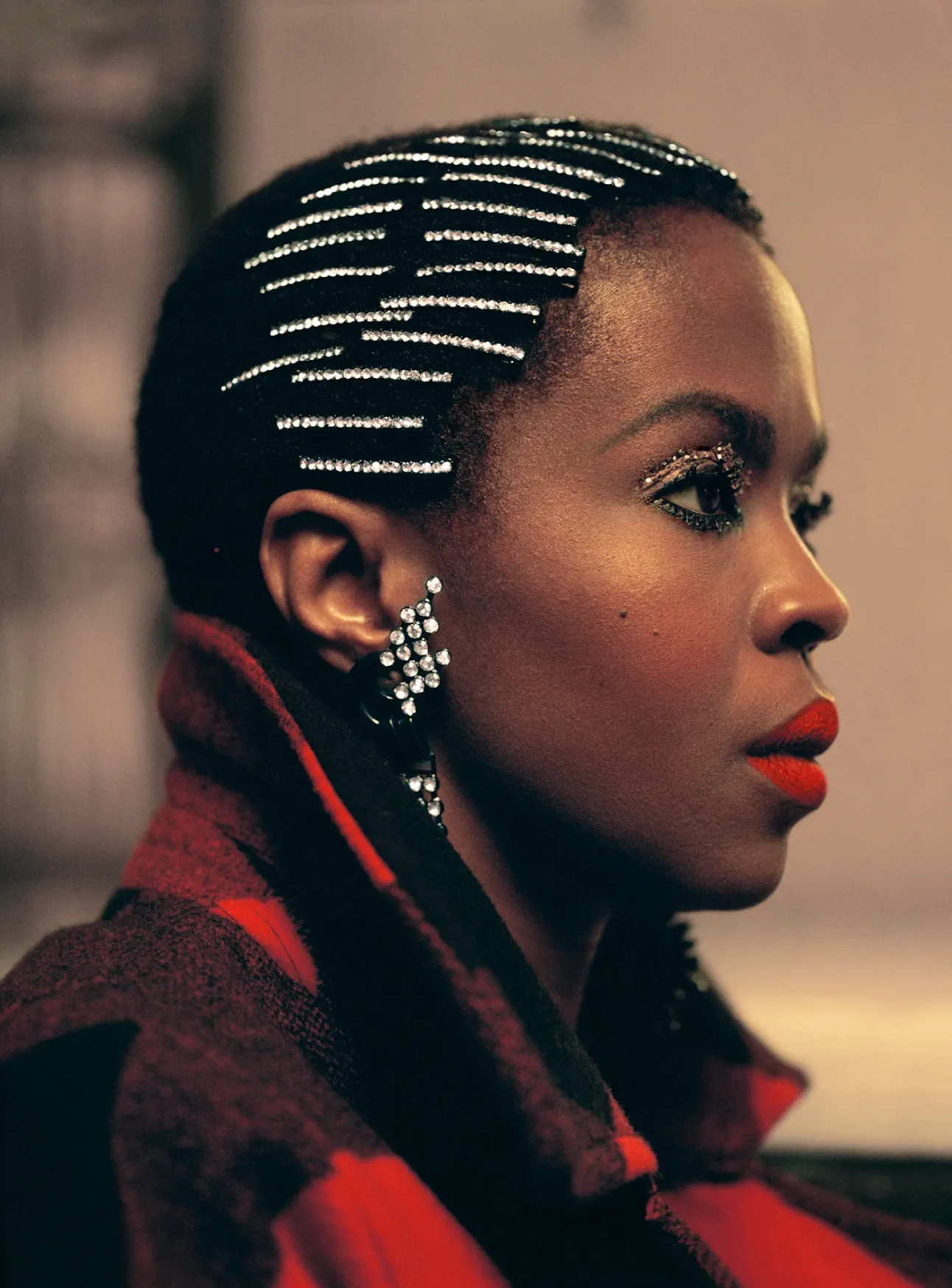
- Feed post · 4:5
- Story · 9:16
- Square · 1:1
- Banner · 16:9
The Sankofa poster, rebuilt from its template: one design reflowing to every format.
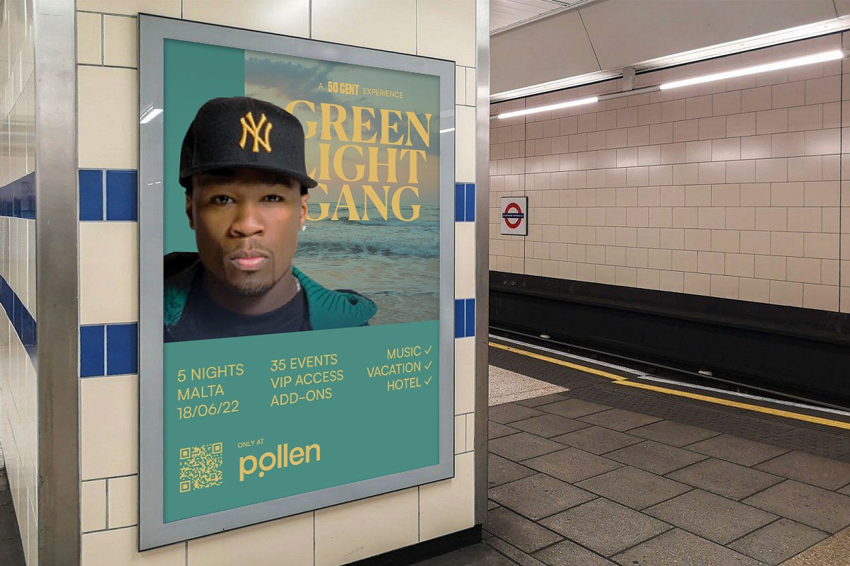
Green Light Gang, on the London Underground.
Pitch sites
04
92% of visitors arrived from Instagram, so the pitch site behaved like Instagram.
Almost everyone landed on an event’s first page mid-scroll, and nobody commits $5,000 in that frame of mind. So the page worked like a story: big photos and video, one line each, swiped through.
It sold the feeling, and asked only for an email and a share. The planning could wait for a bigger screen.
Abode on the Snow, the pitch site
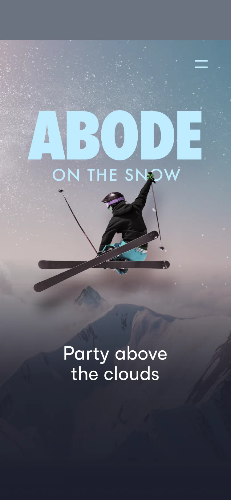
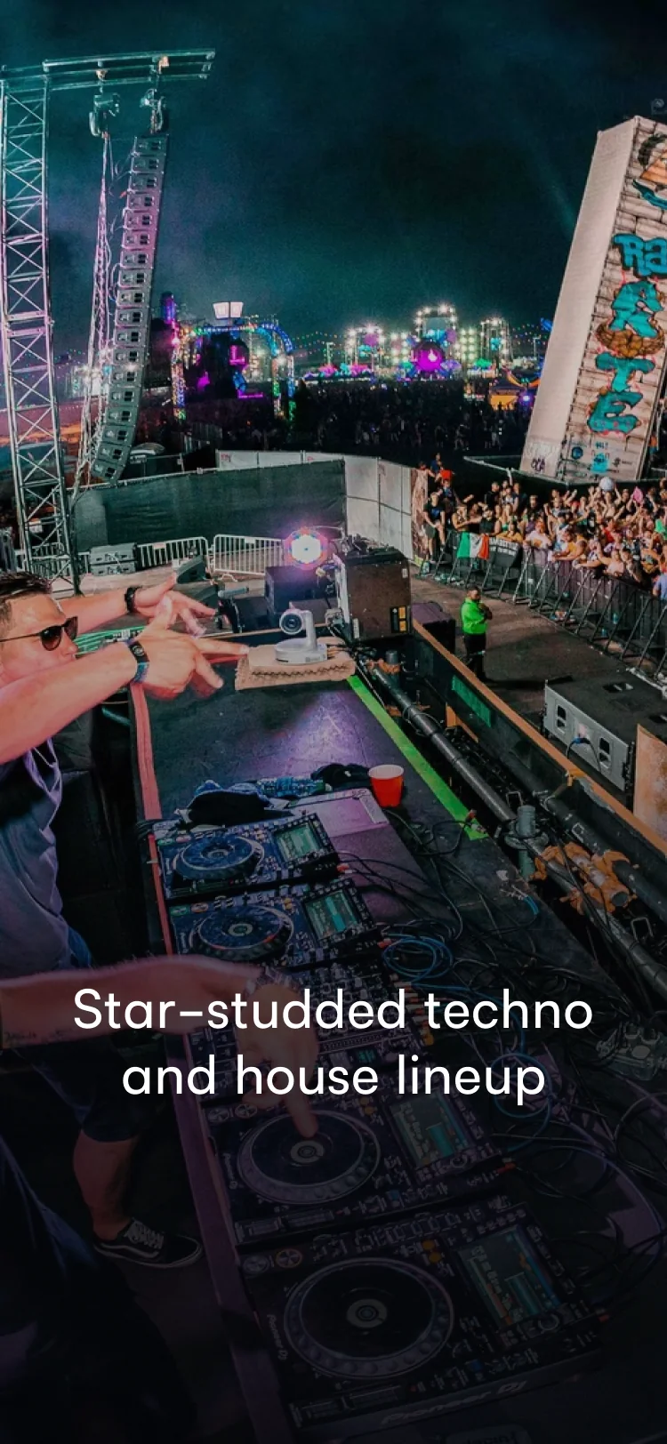
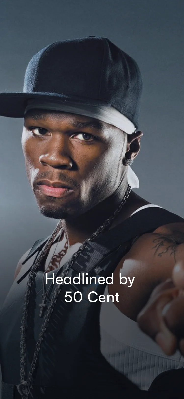
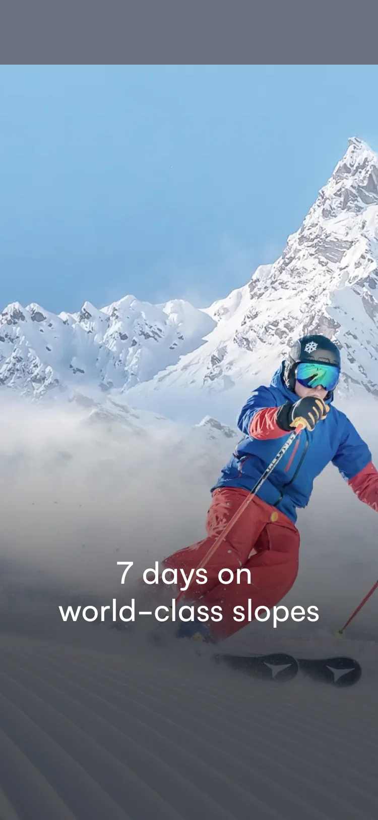
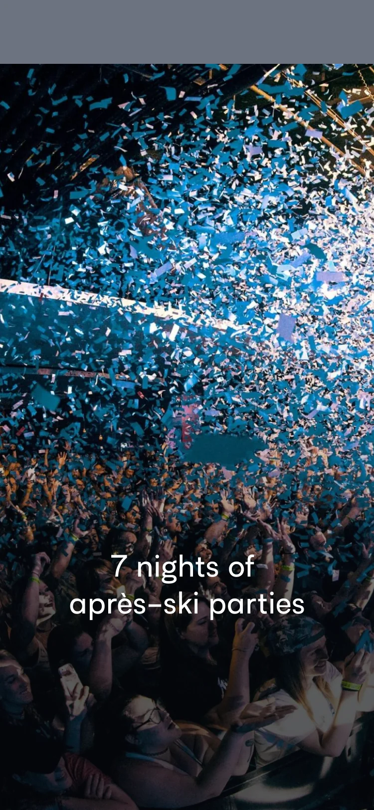
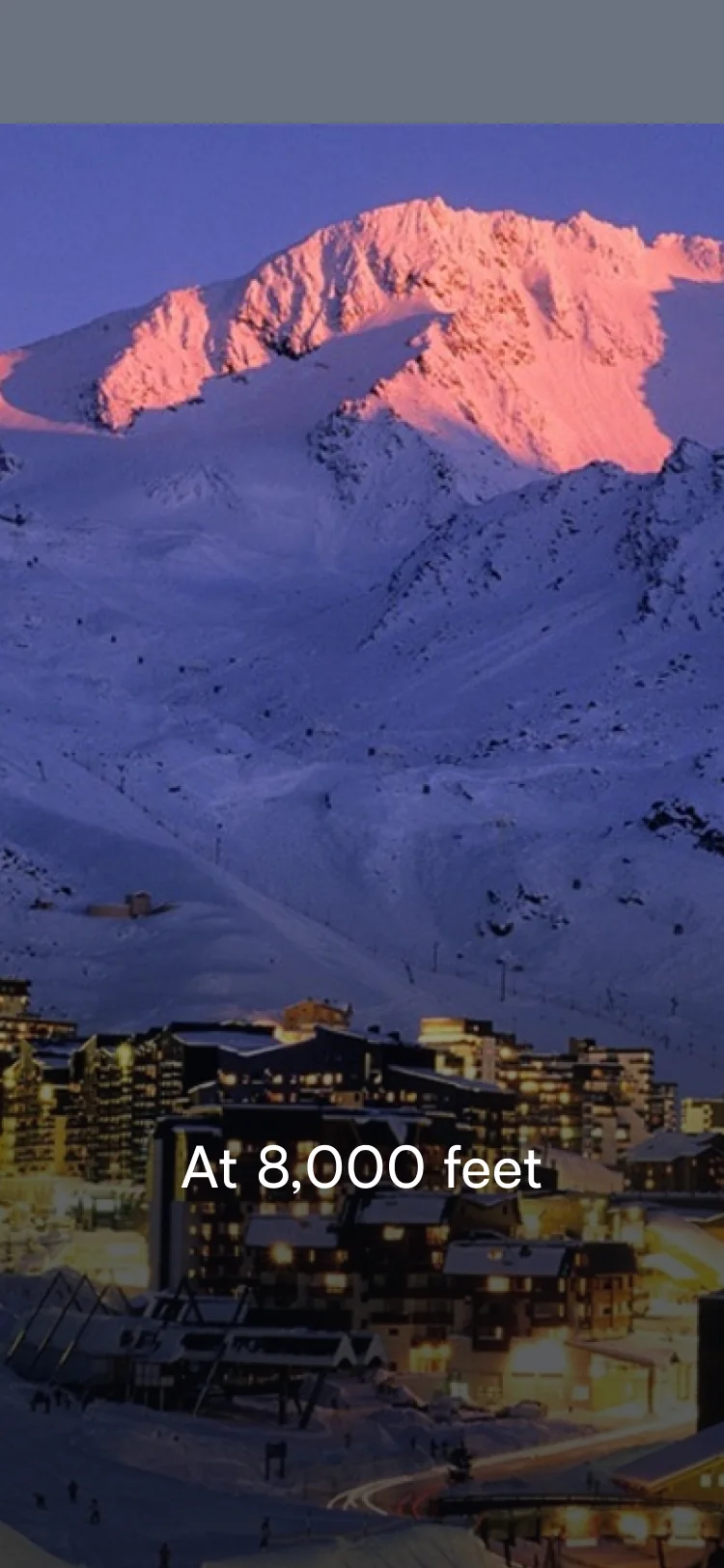
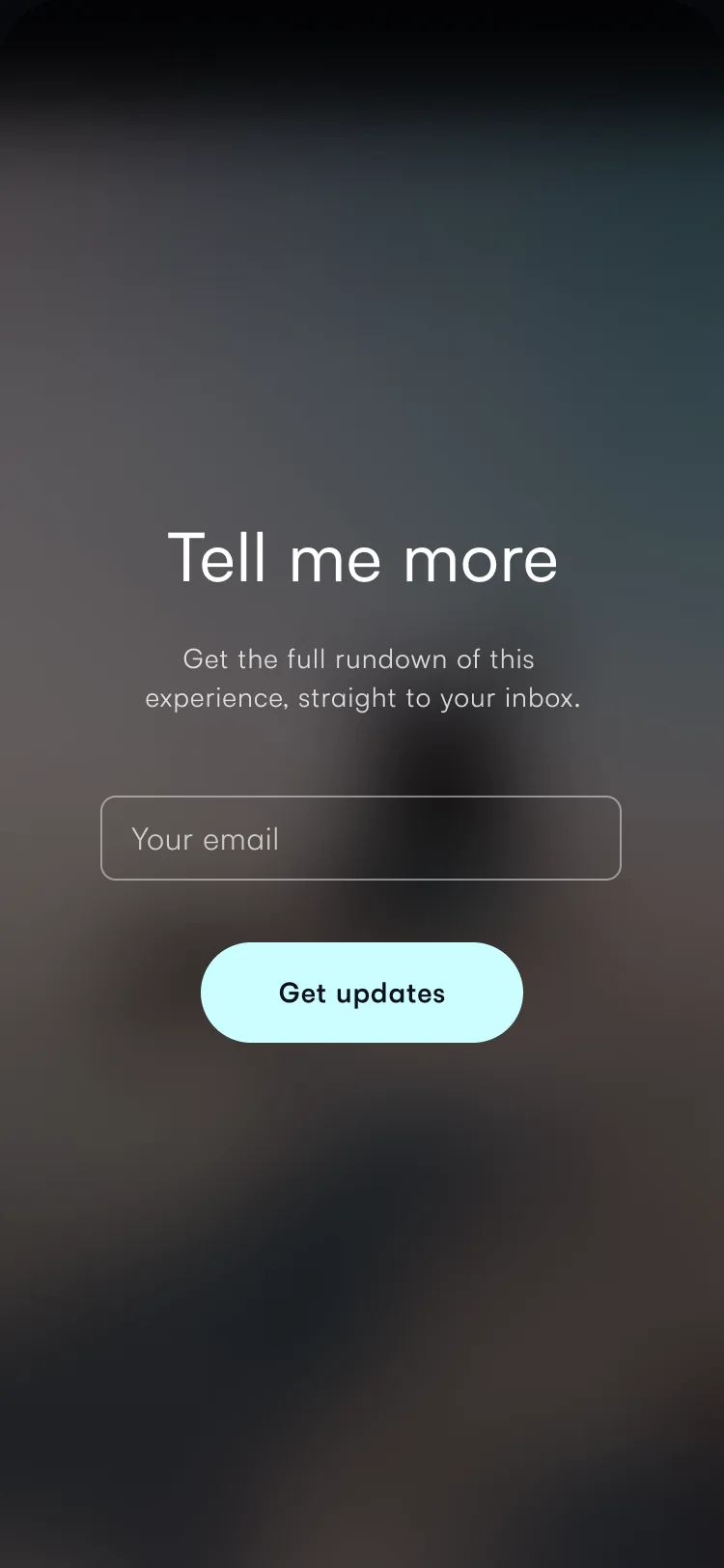
A pitch site, swiped like a story.
Booking
05
The booking site stopped being original and started being familiar.
Booking meant choosing rooms and travel and entering every guest’s legal name, all before a card payment of up to $5,000. We stopped inventing, and used the patterns people already know from Expedia and hotels.com, in the event’s own colours.
The lead booker added everyone’s email, kept the parts they wanted (themselves and a partner, say), and sent the rest to each friend to fill in and pay.
Abode on the Snow





Landing, itinerary, line-up, hotels and the package builder, each in the event’s own colours.
The end
06
Pollen went into administration in August 2022, nine months after I joined.
I led design from Stockholm, a long way from the decisions that ended it. Sign-ups and bookings were climbing on the new sites, but the company ran out of road before we could measure what the work was worth.
My last job there was helping the team land their next roles.